
Sunday, 12 August 2012
Corner bookmarks.
Thanks again to Ruth ov on apassionforcards.blogspot.com for her idea.

Cards for a commission.
I have a lovely friend who frequently gets me to make cards for her. She certainly makes me think!!!
This one was easier. It had to include music and flowers. I was pleased with how it turned out and my friend loved them both, phewee!!


This one was easier. It had to include music and flowers. I was pleased with how it turned out and my friend loved them both, phewee!!
Butterflies again!

The Craft Stamper magazine came with a free butterfly stamp this time. Needless to say they flew off the shelves and I just had to get the distress inks out,....AGAIN! Lol.
In this card I used a tim Holtz technique where you stamp with archival ink into the debossed side of an embossing folder before passing it through an embossing machine. (It is important to remember to clean the folder immediately with a stamp cleaning solution otherwise it will stain!!!!) This then gives the impression of the script, in this case, running behind the raised areas. This was a French script so I didn't worry that it came out back to front, although you can get "reflections" stamps which leave the stamped image the right way round. I haven't invested in those...., yet.
The background was coloured with distress inks, butterflies stamped then made to pop out by using the same colours of ink with a water brush to tint the wings and make them pop. The edges have a light tinting of black soot distress ink before being mounted onto black then the white card base.
...and again

Not much to say. I kept the same colours but used circles to highlight the beautiful stamped image and used a water brush to tint the main butterfly which was cut out and raised on foam pads.
Mini book.
Ok, talk about shooting yourself in the foot! I brought this project along with another idea to see which the class wanted to make for their next advanced project. Bad idea. Someone (who shall remain nameless) cough "Margaret" asked 'but could we not do that next week instead of two cards?' .... Well,.... ok then!lol.
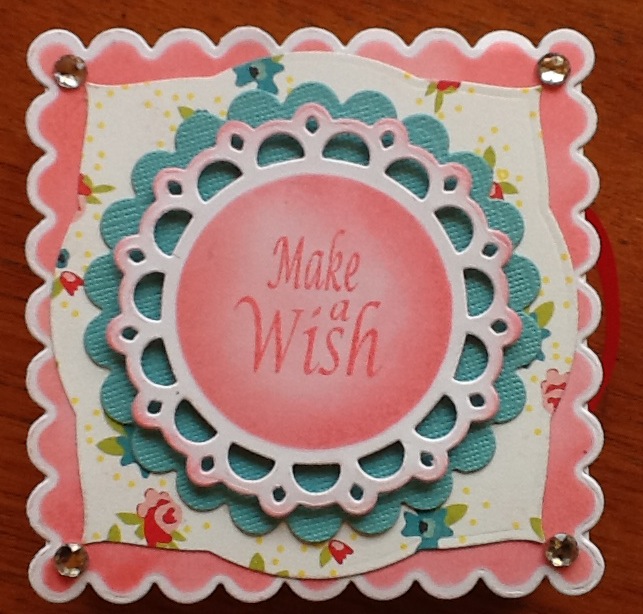
The pages slide out for photos or journalling.


The pages slide out for photos or journalling.
Slider box.
This was our advanced class project for July. The idea and a tutorial can be found on the splitcoaststampers resource page.
This is quite a technical piece and I had a few attempts before I got it right. This did mean that I knew the pitfalls and was able to ensure the class ran fairly smoothly with only a few mistakes being made and those easily rectified. Btw, if you ever need to unstick something a quick blast with a heat gun softens the glue and allows you to remove the stuck piece. ... Go on, ask how I know?..... Lol
This is quite a technical piece and I had a few attempts before I got it right. This did mean that I knew the pitfalls and was able to ensure the class ran fairly smoothly with only a few mistakes being made and those easily rectified. Btw, if you ever need to unstick something a quick blast with a heat gun softens the glue and allows you to remove the stuck piece. ... Go on, ask how I know?..... Lol

Butterfly box.
5th July class.
Out with the distress inks for this gorgeous urban stamp from Papermania. We created a distressed background the stamped with vintage sepia versafine ink. The card was made from a 12x12 sheet cut 5.5" x 12 and scored at 4",7.5",8" & 11.5".
The aperture w cut using an x-cut die and another small piece of distressed card stamped with the sentiment slipped in behind. A couple of prima butterflies had their wings tinted too before being attached. The box opens up as the card is opened but folds flat for postage.

Out with the distress inks for this gorgeous urban stamp from Papermania. We created a distressed background the stamped with vintage sepia versafine ink. The card was made from a 12x12 sheet cut 5.5" x 12 and scored at 4",7.5",8" & 11.5".

The aperture w cut using an x-cut die and another small piece of distressed card stamped with the sentiment slipped in behind. A couple of prima butterflies had their wings tinted too before being attached. The box opens up as the card is opened but folds flat for postage.
Anyone for ice-cream?

Bring on the summer. Well we can live in hope..lol. This confection is courtesy of Woodware. Simply coloured with pro markers then we used silver sticklers to give the impression of silver ball decoration and irridescent sticklers for the sugar strands. It's almost good enough to eat, lol. Ooh, and not a hint of distress inks!!!
Wedding hearts.

This card was super easy but I think it looks so stylish and simple. We punched and die cut the hearts, trimmed a white one down for the gents shirt and added a knot of grosgrain ribbon for the bowtie. The white scalloped heart was embossed and 3 pearls added. Some shocking pink card and a little bit of ribbon for contrast and texture coupled with the "love" saying make for a quick wedding congratulations card.
A card for dad.

Cards for men can be tough but not when you have a perfect stamp like this. The background "boards" of the shed are from a technique I found on stamp tv and suited this card so well. A little bit of raffia and some gauzey ribbon (I don't know what it's real name is, lol) create that more masculine feel. The image was coloured with pro markers. (what else?)
A tissue?
28th June class
I saw this cute idea for a get well card and just had to try it. It went down a treat with my class! Such fun. The papers are from the kanban factory shop which I visited on my hols in May. Well worth the searing heat that day since I got a huge box of card for only £30. The white base card was tinted with spun sugar distress ink and the edges of the flowery card was distressed with pine needles.

I saw this cute idea for a get well card and just had to try it. It went down a treat with my class! Such fun. The papers are from the kanban factory shop which I visited on my hols in May. Well worth the searing heat that day since I got a huge box of card for only £30. The white base card was tinted with spun sugar distress ink and the edges of the flowery card was distressed with pine needles.
Let your light shine.

A beautiful image from Michael Powell, but I struggled with all the detail so decided to spotlight the lighthouse. It's funny because this bible verse had been in my head for a while just waiting for the opportunity to be used. I class we used the harbourside bazzil cardstock and the peacock feathers distress ink. This was one of Thomas cards which actually came together quit easily once I decided how to approach it. I love how all the colours work together. The verse I found by doing an online search so thanks to whoever designed such a perfectly matching insert!
Naomi's graduation
Now I have to go back in time to before I began my blog.
16th November 2011
Level 4 Higher Professional Diploma in Early Years.
Strange to realise that my younger daughter graduated first but there you go. I believe both girls are perfectly suited to their chosen career paths and Naomi currently works in a school for children with special needs. She knew exactly what she wanted to do and in fact since she was a little girl I always thought she would work with children. If she ever disappeared on a shopping trip I only had to look for the nearest pram or buggy and she would be peering in. I am so proud of you too titch. I am blessed to have such wonderful children.
16th November 2011
Level 4 Higher Professional Diploma in Early Years.

Strange to realise that my younger daughter graduated first but there you go. I believe both girls are perfectly suited to their chosen career paths and Naomi currently works in a school for children with special needs. She knew exactly what she wanted to do and in fact since she was a little girl I always thought she would work with children. If she ever disappeared on a shopping trip I only had to look for the nearest pram or buggy and she would be peering in. I am so proud of you too titch. I am blessed to have such wonderful children.
Ruth's Graduation.
20 th June 1012
BA Hons Community learning and Development.
This was a busy time for us as we had a trip to Dundee, so we took a week off and a wee break. Time to catch up with daughter no 1.
I want to take this opportunity to say Ruth, I am sooo proud of you. I know it was never really in your plan to go off to university but you knew it was a necessary evil in order to be able to pursue your chosen career. Well done toots!
BA Hons Community learning and Development.

This was a busy time for us as we had a trip to Dundee, so we took a week off and a wee break. Time to catch up with daughter no 1.
I want to take this opportunity to say Ruth, I am sooo proud of you. I know it was never really in your plan to go off to university but you knew it was a necessary evil in order to be able to pursue your chosen career. Well done toots!
25 years ago....
Ok here we go. I am gonna try and update things in the correct order. This could take some time...!
16th June 1987 Gary and I were married. It seems like yesterday so I can't really believe we've suffered each other for 25 years!!! Roll on another 25...

16th June 1987 Gary and I were married. It seems like yesterday so I can't really believe we've suffered each other for 25 years!!! Roll on another 25...
Friday, 13 July 2012
Family mini book

Well now, I had even sent this photo to my blog ready to write about and somehow completely forgot to get it posted! What am I like? Anyway, this was June's monthly project. I have to say thanks to Edna over on anotherdayanothercard.blogspot.co.uk because when I was having a mosey around her pages I came across this idea. I had done the fold before but had kinda forgotten about it. These gorgeous papers had just come into the shop and I knew I wanted to use them so the idea of a family mini book came about. The wee pages can be removed and photos added. I think the neutral colours leave a book suitable for either vintage or modern photos. Edna has written a tutorial for this concept so head on over to her blog and have a look. You can admire her fantastic cards while you're there. Oh to be half as good at colouring in...
Be back soon with some more catch up cards, lol
I'm off to sit on the naughty step....
Hi everyone, I can't believe it's a whole month since I updated my blog. I'm sure you all thought I had forgotten about it! It HAS been a busy time and I have lots to show you so be prepared for lots of posts over the next few days. I will also explain my absence, lol.
Tuesday, 12 June 2012
Hats off

What I did..... On my holidays!

Well I took a little bit of Cardmaking stuff but decided, instead, to concentrate on getting this blanket completed. My step dads granddaughter is expecting her first baby and we know it's going to be a little girl. I love how this turned out and hope she does too. I think it only took me 10 days. Got another few to do as some friends and family have babies due over the next few months.
Friday, 18 May 2012
Formal for men

Subscribe to:
Posts (Atom)