Saturday, 12 May 2012

For the graduate

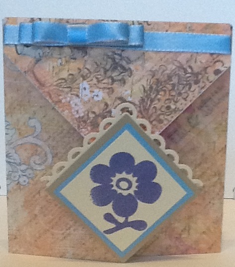
For our second card we made this graduation card. I suppose because I have a daughter graduating in June I thought it was about time I tackled a card for this occassion. The Design paper was really good as on one side it was flowery and the other had a grid pattern making it suitable for either boys or girls. To keep this feel throughout the card we used fairly neutral colours.
The biggest problem we had was convincing some of the ladies to tear up the book pages. It was funny though when one of them found quite a "racy" passage. I was accused of being a bad influence!! ME!! after all I never said to read it!! Lol. Anyhow the pages were torn up and inappropriate pieces discarded, so we had lovely cards at the end of it all. (and sore sides from laughing! :)

Saturday, 5 May 2012

One stamp two ways!

Ok, hi everyone. Just a wee quick update. My classes are now being held on Thursdays so you can expect the posts a little later in the week, probably Friday or Saturday. Hope this doesn't upset you too much!!

We Played with the agapanthus stamp from Woodware this week and used it to make two very different cards. This one used the emboss resist technique and we then spread glitter glue over the flower for a sparkly finish. The shiny navy card (from the paper mill shop yonks ago) was punched with the crafty edger and the border is from the Woodware grasses stamp set.


This card was so quick, literally a 5 minute job! I chose a hessian effect white card stock and gently dragged bundled sage distress ink across the bottom and broken china across the top to highlight the texture. The agapanthus was stamped with chipped sapphire and the stem lengthened by pressing the edge of a plastic ruler into the same ink pad, lining it up and "stamping" it down the length of the card. The sentiment was stamped with rusty hinge distress ink. All in all a very quick and quite masculine card. The agapanthus takes on the role of 'tree' quite nicely. The ladies decided this would be an ideal project for making up into sets for quick gifts.

Wednesday, 2 May 2012

What I got up to today!

Just a little something I threw together!!
NOT really, it took me most of the day but I had great fun. Inspired by Heather at Doodlecraft!!

Wednesday, 25 April 2012

Telescopic Molly.

What fun we had this week! I had a look on the Molly Blooms blogspot and saw this design idea although I didn't use as many layers. I love these images and how the card folds up.

This one used the technique 'faux patina' from split coast stampers. We started with wild honey on the embossing folder then built up the colour with chipped sapphire, crushed olive and finally rusty hinge. While the inks were still damp we sprinkled on the gold embossing powder and if it was too heavy in places rubbed it off before heating. I love the aged metal effect which results. The background is a Woodware stamp called grasses. We used wild honey and scattered straw distress inks.

More for the show.

Show samples

I demonstrated the Crafty Edger from Woodware at the show. These are some of the samples. This card is 8" square.

I think this "mad" cake was a result of desperation. I had so much sample space to fill!!! Lol

Fairies

These are the cards we made in class last week. I've got some samples I made for the show to upload later too. I really hadn't time to put them on sooner. What a busy few days, but great fun too.

On to the fairies! I just love how the background colours glow through behind the silhouettes. We rubbed different coloured distress inks onto an embossing folder, spritzed it with water then laid the pearlised paper on top and pressed it down with our hands. This means the design remains and the whole piece is flat. It does try to curl up quite a lot but will flatten as it dries. The hero arts image was stamped on using archival ink once the background had dried. The edges were very gently tinted with black soot distress ink. Due to the nature of the pearlised paper it takes very little to do the job!! The black pearls finish it off. I don't know why but when I had the sample made I decided I wanted to tatter the edges.


This card uses the same stamp we used last time but we used chalk inks to ink it up. I went back to a favourite design, the waterfall card. I honestly thought the ladies would have done this before but it turns out they hadn't and were really pleased. The background is a blended spritz and flick technique from Tim Holtz.We also made a tassel for the end by knotting and fraying grosgrain ribbon.

Tuesday, 24 April 2012

Next weeks advanced project!

Hello everyone I just wanted to take a minute to show you the upcoming project for Cleo Crafts advanced class on Thursday 3rd May. This is designed to store clear stamps, in this case my Woodware ones. It's going to get a wee bit more decoration and maybe a tie closure.the class is booking up fast so if you're in the area and are interested please book soon!!

Friday, 13 April 2012

Butterflies and flowers

I finally got caught up. These are the cards we made in class this week!!! Hurray!! And even better next weeks are all prepared and ready! Wow I can hardly believe it!! It's unheard of! I'm usually finishing up on a Monday evening for the next day, lol.

This first card is my take on an idea from Papercraft Inspirations magazine. A bit butterfly mad but a good lesson in using pva glue sparingly.


This second card is also magazine inspired, this time Craft Stamper! Instead of masking as they had done we created a distressed background then stamped the image 5 times with archival ink. These were then cut out and layered up. the music was stamped with tea dye ink to give a subtle background.


I always think the blended distress inks seem to glow with colour. I loved this card even before I had it finished and the ladies seemed to like it too!

A bag inside a bag

First off on this post I have to say a BIG thank you to my lovely friend Sarah who kindly allowed me to use her gift bag tutorial idea with my Tuesday night class. You can find it on sarahslittlesnippetts.blogspot.com. Now I have to tell you that one of my lovely ladies told me she would have trouble sleeping that night as she was so excited :) how good is that!!


The little bag we used for the gift inside was adapted from one seen on jantink.com. Well I think I put the ladies through their paces and maybe was a bit over optimistic about how quickly we'd get things done because it was close to 10pm before we got away home!! ( we're supposed to finish at 9). Sorry folks. On the plus side everyone was pleased with their bags and I was buzzing with excitement too and already thinking about what to do next month.


P.S. It's a pity I stamped the border the wrong way up on my pull out tag!!

Tea and "pop"

Well Woodware stamps are really ticking my boxes at the moment. This tea pot is another from them and at first I thought it seemed very long and kinda out of proportion. I had been surfing the net for ideas and saw the "outside the frame" tutorial on you tube. This x-cut die seemed to balance out the design nicely. Also for the first time in ages I was happy with the first colours I chose. I remembered I had the cherry blossom stamp, used in the background, in an oriental set from Papermania which ties in really well too.

The "pop" part of the title refers to the bottle cap used in the centre of my flower in this design. I got the card idea from inkingidaho.blogspot.com and it has been hanging around for some time but I couldn't work out how to get the 'bite' out of the card. I had been trying to use the tattered florals die but having no success. Brainwave, I used the daisy die again this week. The centre of the popped bottle cap is 1" in diameter so it was easy to punch the patterned piece. we used the budding vine folder from craft concepts to emboss and fired brick distress into highlight the design. The wing from the stampin up build a bird punch was used as leaves.

Scrap happy

The class on this week focused again on using up some scrap pieces of card and paper generated from recent projects. Both the circle and the patterned piece on this card were leftovers, as we're the strips we cut the flowers from. We used the x-cut daisy dies and coloured a gem for the centre. I have been trying to incorporate a doiley into my designs for a while too so this design allowed me to do so. The bare card base was stamped with a little star using distress ink which was water-brushed.

The second card uses a Woodware stamp very similar to that used in the previous class so I wanted a different technique. The letter "b" and the flowers were flat coloured picking out colours from the scrap papers we stamped on to create the remaining letters.

Pop-through birdhouse

I loved this little bird house image from Woodware immediately I saw it but was at a loss about how to present it to make it stand out.After all I don't just want to flat stamp, colour and layer up all the time. I then attended a class with Norma and she used this pop through idea. It was just the inspiration I needed!!


The tricky bit was making sure that the image was in the correct place so that it would pop out of the aperture in the card front smoothly. Of course I had to add a little bit of bling to finish it off!

It's a gift

I enjoyed working with acetate and the floating effect so decided to play with it again. I struggled for a while to work out what was going on the "other" side but once I chose the embossing folder it all seemed to fall into place.


I've also used much brighter colours than I would usually choose but am really pleased how it turned out.

Friendship

This is a card similar but not exactly the same as the second card Rhonda taught. The acetate makes the topper look as if it is floating.I have used a different shape and greeting and tinted the topper while it was still in the die.

Well, Hello again

Ok so I've been missing for a while and I really have no excuse. Well I do have one small one! I forgot the password to get onto my blog and lost the book I had it written in.... Not so good but I'm back and have got soooo much to update so please forgive me. I'll try to get it all done today!!
Now I can't really take credit for this card. My lovely friend Rhonda taught this class when I was away in Cardiff. I suppose you could say it was a joint effort. I cut out the kit pieces and Rhonda did the rest. She used a kissing technique on the stamped flower which left an almost marbled effect.


I love how this card opens out!

Saturday, 10 March 2012

Butterfly surprise


Yet more butterflies. I think most people like them. I discovered by accident that I must be quite fond of them when I started to realise how many butterfly images I actually own in one form or another. Again the idea was found on you tube but oh my goodness, I threw soooo many pieces of paper in the scrap box for nursery. I just couldn't get it to work. Mind you I was trying to simplify the design and change the dimensions too. Not recommended!! When I stuck to the instructions it worked but I was then able to simplify it a bit and take out some of the fiddly measuring. The tutorial is called 'surprise box card' on you tube and provided by www.frenchiestamps.com. The paper I've used is fancy pants design " rusted sun'sunny'." The butterfly is one of the first I ever bought for my cuttlebug and is a set of cutting and embossing folders. We applied the ink (spiced marmalade distress ink) directly onto the embossing folder and this was then transferred to the cut out shape as it was embossed. We used a punch from EK success for the borders and another for the tag the butterfly is on. It was punched once from ivory and twice from orange card then both orange ones were cut in half, one lengthways the other across the short way. The lengthways pieces were trimmed a little and then attached above and below the ivory topper. The short ends were then matched up to make it look as if the orange is a whole piece slightly bigger than the original. Hope this isn't too confusing. If you get stuck let me know and I'll try and take a few photos of the process! The little tags can be included as a gift and were punched with a clippy punch I've had but hardly used.

A tisket a tasket...


Well not quiet a green and yellow basket but almost. I must say I had planned something completely different than this for Tuesday evening class, but when I came across the idea I was a complete basket case. I've made 8 so far and all those papers I've been hoarding? What a great way to use them up!
On the other hand I always fear I'm gonna push the class so hard they won't come back!! Lol. This creation is made from 12" square card and paper and takes just over a sheet of each. The version we made in class was much plainer and began as a 6"square. If you want to see them they're on Cleo crafts blog page. Instructions can be found at thelittleblueroom.com. If you go to the drop down tab 'the desk' and scroll way down you'll find them. Lots of other ideas there to inspired you.
This one will go to my lovely mum with the fuschia card and I'll have to find something to put in the basket too.

Diamond pocket fold


Hi everyone and apologies for being missing until so late this week. I'm preparing for a trip to Cardiff and have been really busy.
 Well I had 3 classes this week and it was nose to the grindstone for all I can tell you. I worked hard doing the prep and everyone else did too completing them. Tuesday morning class made this card. I found the instructions on you tube and what is essentially a piece if 12"x12" paper becomes quite impressive. It ends up measuring about 4.5"x 4.75". The paper is from k&co and is called que sera sera floral collage. The stamps are the do crafts V&A potpourri set again. They are stamped with Paris dusk memento ink. if you want to find instructions please go to the site I found them on, www.wickedlywonderfulcreations.blogspot.com or look up origami diamond fold card on you tube

Butterflies again

This was the 2nd card on Tuesday morning and I love the rainbow colours and how the simple design comes together. I had originally made it without the card candi but thought it needed something. I opened my drawer for some tape, saw the candi and knew that was just the thing. This is very similar to a card I saw on someone's blog recently but I don't remember whose. Please let me know if you've seen it so I can attribute credit. The embossing folder is "Venus."

Saturday, 3 March 2012

Flower power

I know I was supposed to put photos on yesterday but a friend reminded me that she was heading to Norma T's class today and I didn't want to spoil the surprise for her. I've been busy in the craft room but have decided I'm going to use some of the ideas in class so will hold off posting them till they're taught!

Meanwhile this is a card made with the doily and flower. The background paper is a Kate Knight design which came as a gift in a mag. I used the cut-offs to decorate the front of the envelope. The butterfly is punched out of the card I dragged through the cosmic shimmers while they were still wet on the protective sheet. Waste not want not!!


These magnificent fuschias are all thanks to the brilliantly talented Norma. I had a great time at her class last week and still can't believe how amazing these turned out. Margaret C I know you will love making them with Norma too!! These are so 3d that they need to be posted in a box but I honestly think they are well worth the wee bit extra expense. I think my mum is going to get this card on 18th for Mother's Day.

Thursday, 1 March 2012

Did you guess??

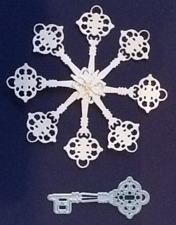
The 'doilies' are made with the Marianne Creatables Christmas baubles. I did say there was a clue!! Can you see why I got so excited? Or am I just a raving lunatic after all, lol. Simply cut eight and hold them together with a brad. I think I'm going to try using two different lots of four to see what other styles I come up with. Hope you loved it too!! Back tomorrow with more photos. See you them :)

Here they all are.


The key is a little different. I poked a hole at the end so the decorative head was out.

Dandelion wishes

The second card is a decorated squash fold. This is basically a tea bag fold only done bigger and can also be extended to make a mini book. It's amazing that how that wee bit of glamour dust just gives it a lift.


The green behind the topper was embossed in the Cuttlebug but it doesn't really show up too well. We started off with an 8" square and the finished piece is 4". The dandelion is from Stampendous. It was inked and stamped twice so the second image was paler. The bamboo in the top right corner is a Papermania V&A clear stamp. The edges were distressed with fired brick and a tiny bit of peeled paint distress inks. The organza ribbon was trapped behind the topper with the foam pads used to raise it up.

Dandelion wishes, inside.


This is how we decorated the inside. We used the fired brick again and a big dandelion head stamped randomly all over the red base card. The same double stamping technique was used too.

This is the day

Well I did promise to update you today but I got into the craft room and everything just seemed to work out so it was hard to drag myself away. I will upload some photos tomorrow. Meanwhile this was one of the cards we made in class this week.


It is a CASE of one I saw on vervestamps.blogspot.com. I reversed the colour scheme and put less bling on too. Love how it turned out. It's good to get more spring time colours and a bit of freshness into the card making again and when it's a beautiful day it's even more reason to praise God and rejoice!!